Fueled by a decade of monetary stimulus.
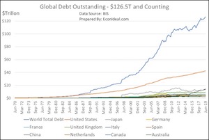
Last time I tallied the global outstanding debt was in 2011 using 2010 data. At that point, the number stood at $95.5T.
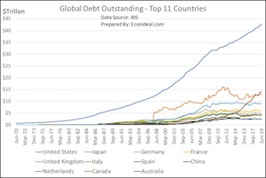
I recently updated this tally using mid-2019 data from the Bank of International Settlements (BIS), and the latest number stands at $126.5T, a 32%+ increase. U.S. debt outstanding is over 3x ($42.2T) the next highest debtor, now China, who surpassed Japan in the last two years. This follows significant growth in issuance of U.S. Treasury debt (funding an all-time high in the Federal public debt) and Corporate debt (fueling record levels in the corporate bond market), but also brisk growth in Mortgage and Household debt. China is dealing with its own issue of high debt levels amidst a slowing economy, and the Eurozone is struggling with wildly unpopular negative rates that do little to spur weak economies.
I have gathered various components of the growth in U.S. debt outstanding over the last several decades, and the trend in interest rates - this data can be found in a companion article HERE.)
The impact of this growing debt and the typical central bank response of greater easing is discussed in an article I published recently 'QE4, Repo, Inflation, Debt: A decade of monetary stimulus and the consequences of more'. The growth of debt and monetary easing has occurred amidst a rather reckless disregard for the actual statistics for GDP, unemployment and inflation that point to a 16+ year ongoing recession in the U.S. alone, throttled by structural problems that are underscored by lower productivity, lower industrial production, and a growing negative balance of trade, which have not been ameliorated with the latest trade skirmish and supposed truce between the U.S. and China.
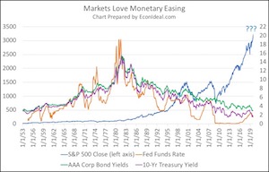
I’ve primarily written about the hazards of cheap money and monetary easing, here and elsewhere. Admittedly, it is hard to convince many of the hazards when the markets (stock and bond) have a record decade, as they have had from 2010-2019. Markets love monetary easing (chart below). The hazards: risk asset price inflation that puts markets into overvalued territory for significant periods of time, placing volatility risk and interest rate risk into greater territory. One only has to look at the monetary easing love chart to see this volatility in the stock markets when the Fed signaled tapering its asset purchases (2013), or actually started tightening (2016 with the FFR and again in 2018 with the balance sheet). The markets and rates become volatile when the Fed does not provide a continuous backstop.
Finally, I’d like to add that the low rate environment promoted by the Fed and other central banks is economically regressive, it does not “raise all boats”. Instead, it prices a large swath of economic participants out of markets and opportunities. The “wealth inequality” issue that is now forefront is in part a result of such +/- zero interest rate policies, or “ZIRP”. This is the downside to accumulating so much public and private debt and not having the obligation that the debts are serviced at a market rate.


